


What The Slug?

Case in point? Here are your 2013-14 Buffalo Sabres alternate uniforms. I apologize in advance.

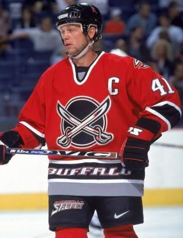
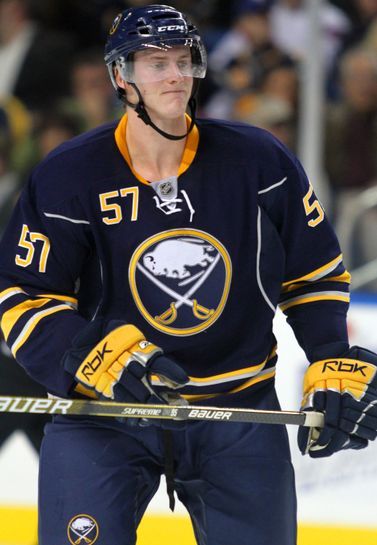
Holy Jesus! What is that? What the [expletive] is that? WHAT IS THAT, PRIVATE PYLE?Yeah, that's horrific. Steve Ott's smile has to be from the laughter from the guys standing around him. I have seen bad jerseys before from Buffalo - the Barney Rubble hairpiece-esque BuffaSlug, the red alternate jersey, the black-and-white Bison head - but this one is absolutely and truly garbage.
How a team can go from this gorgeous look to the patchwork uniform above is beyond me. But we're not done there. Oh no... it only gets worse when Steve Ott turns around. I apologize in advance again.

Let's break down this uniform faux-pas, shall we?
I am a fan of yellow uniforms if they incorporate traditional elements. This uniform does not. There is far too much gray on the uniforms. There are two different shades of yellow seen depending on the light source. There is far too much gray on the uniforms. There are white sleeve stripes that end at the chest for no reason. THERE IS FAR TOO MUCH GRAY ON THESE UNIFORMS.
I'm not sure why the logo isn't outlined in navy blue rather than gold when it is placed on a yellow background. The logo is the brand, so why doesn't the brand stand out? If the Sabres had simply changed the outer circle to navy blue, the logo would pop off the chest. Instead, it kind of bleeds into the yellow sweater around it. Personally, that's a dumb move. And there is still far too much gray on these uniforms.
Have I mentioned the gray yet? It seems this is now a major part of the Buffalo colour scheme when I was under the impression that they owned the blue-yellow scheme as worn by many Sabres in the past. The Sabres use gray as an accent color, not a primary color, yet there it is from mid-forearm to fingertips. And occupying most of the space on the numbers. WHY IS THERE SO MUCH GRAY? Ott looks like he's wearing a gray shirt under a much-too-small-for-him jersey. This is beyond stupid. I gotta move on because I'm getting angrier as I write this. That's never good.
Other snippets of hate? The city name on the front. The logo is the brand, so why does a team need the city name on the front? Is this like a label in case they happen to lose them on a roadtrip - "If found, please return to Buffalo"? Why do teams insist on doing this when there is a logo right there that is the entire brand of the team? I'd fail the jersey right then and there if there still wasn't so much idiocy to point out.
I may have mentioned the massive amount of gray on the numbers, but why is the name and number so freakishly huge? Steve Ott's three-letter name is bigger than the entire Reebok word mark above it, and we haven't looked at names like Grigorenko or Tallinder which may stretch from elbow to elbow with this new font. And look at the size of that number in terms of its width! What happens to guys like Tyler Ennis - already a little guy at 5'9" tall - when it comes to affixing his #63 on the back? Will it even fit on the navy blue portion of the jersey?
Speaking of the navy blue part, does it not look like Ott is wearing a cape or cloak? Why on earth would any team outside of some minor-league promotional game wear a uniform that looks like one is wearing a cape? The Sabres don't play in Gotham. They certainly don;t have Clark Kent as a season-ticket holder. The idea of wearing a different colour on the front compared to the back is stupidity. Uniforms should ultimately be one colour as a base colour for, y'know, uniformity. Is that so hard?
And why is the front of the uniform yellow, but the back is primarily navy blue? Is this the first time in NHL history that a uniform has been different base colours on the front and back? Seriously, who approved these things?

Ok, enough with the negatives. There has to be a silver lining on this dark-yet-yellow cloud, right?
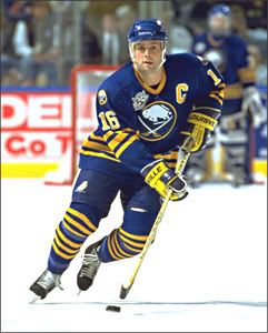
No new logo! That's a positive after the previous logo redesigns. The Buffalo Sabres have always had one of the most recognizable logos in the history of the NHL, and keeping the original logo is a wise move. The fans demanded the original logo, they got it back, and the Sabres shrewdly kept it on this alternate uniform.
The other positive? We'll only see them for sixteen games maximum per season.
Honestly, though, I can't find enough good to even appreciate the negatives to make it a "love-to-hate" jersey. It's just a bad design through and through that has no redeeming qualities whatsoever. It just angers me to look at it, and I feel another Sgt. Hartman quote coming through me that sums up what I think should happen to whomever approved this Sabres jersey to be put in production.
"Who approved that? Who the [expletive] approved that? Who's the slimy little communist [expletive], twinkle-toed [expletive] down here who just approved his own pink slip? Nobody, huh? The fairy [expletive] godmother approved it. Out-[expletive]-standing!"

Until next time, keep your sticks on the ice!


1 comment:
"Sir, it's a jelly donut, Sir!"
Post a Comment