


You're Wearing That? - Part Five
 I hope everyone is enjoying their weekend thus far. I've decided to post another collection of jerseys that may or may not stir some churning in your stomach. Either way, there are certainly some horrible jerseys that I'm about to present, as well as some that you may have never seen before that deserve mentioning. Of course, all these jerseys have meaning to the teams that have worn them, but some are simply horrendous. Charities have benefitted, but I don't know if my eyes ever will. Let's take a look.
If you want to start at the beginning, there are four other general editions of this series, as well as one solely devoted to one team. If you want to check out some of these, please click on the following: Part One, Part Two, Part Three, Part Four, and the IceCats Exposed. Here is Part Five for your visual enjoyment.
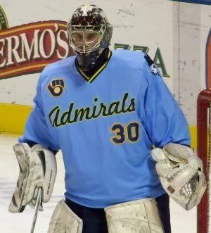
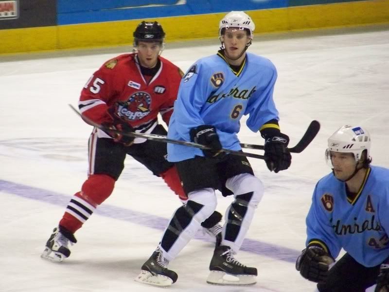
I'll start with the AHL's Milwaukee Admirals. They celebrated a Milwaukee Brewers night this season that saw them wear Milwaukee Brewers throwback-inspired jerseys. These are pretty good until I discovered that Milwaukee committed a serious uniform error: the socks don't match the jersey. If the Admirals can go all out with a jersey, why not spend the extra $10 on socks that match?
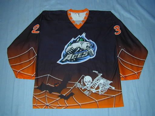
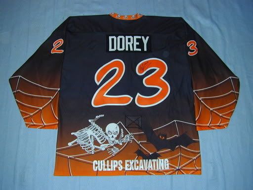
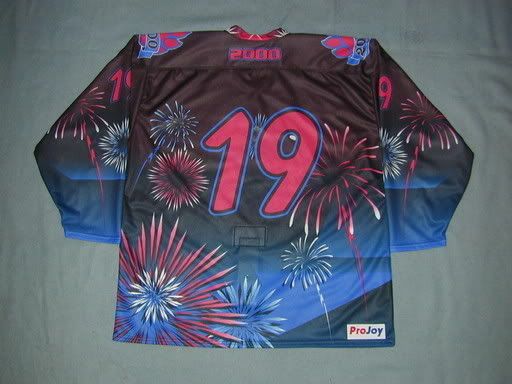
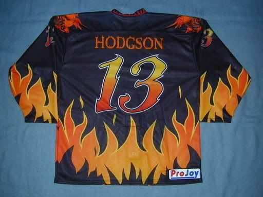
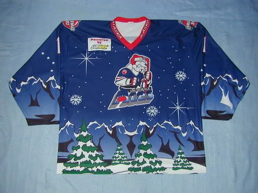
I've shown the ECHL's Alaska Aces in their New Year's jersey on a past article, but I dug up a better look at that jersey. Very classy with the tuxedo look, and kudos for not adding their logo. The Aces, however, have gone on to celebrate other observances as well. They decided to celebrate Halloween in 2003 with this jersey. This one almost won my affection until I saw the back of the jersey. What's with the corporate name? Was the ECHL once a European League or peewee hockey league?
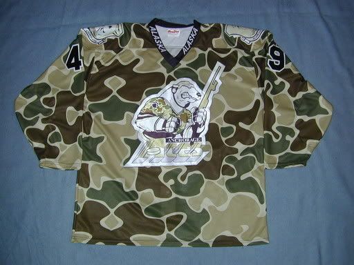
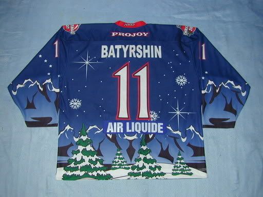
The Aces were once known as the Anchorage Aces when they played in the West Coast Hockey League (WCHL). The Anchorage Aces celebrated the millenium with this jersey, although I thought the rear font could have been better. The Aces celebrated Halloween in 2001, which aren't great, but not bad. They held a Military Tribute night in 2001, which are decent. They also celebrated Christmas with a jersey in 2002-03. Again, what's with the corporate sellout on the back of the jersey? Kudos to the Aces, though, for altering their logo to reflect the promotions.
The NCAA's Army Black Knights make an appearance on this list after they unveiled a new alternate jersey. I honestly don't have a problem with these jerseys. They look pretty good, and the font is easy to read on the back. The boys at West Point look pretty good in these simple jerseys.
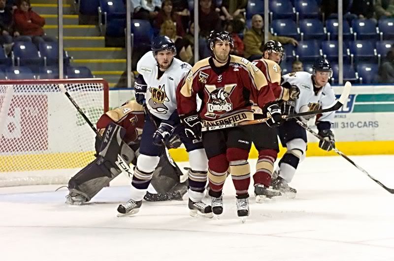
The ECHL's Bakersfield Condors appear again. I don't know how many times I've said it, but enough with the anniversary jerseys. Just put a patch on your jerseys. Bakersfield also celebrated Hollywood with jersey, as well as having a Country Music Night. Bakersfield is in California, so I can understand the stretch with the Hollywood jersey, but why country music? The jerseys themselves are quite flashy, and look alright, though, so they make the grade.
The AHL's Bridgeport Sound Tigers show up as they celebrated a Military Tribute night this season. This jersey looks alright. However, the AHL affiliate of the New York Islanders decided that an alternate jersey was needed last season. Now, the Islanders' alternates made them look like skating pylons, so it would be difficult to think that a team could do worse. Except I'm wrong. Ladies and gentlemen, I give to you the Bridgeport Sound Pylons.
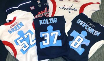
The NHL's Washington Capitals follow San Jose's and Atlanta's lead in coming up with a practice jersey for charity. The Capitals will be auctioning off unique, practice-worn jerseys featuring Athletes Against Autism patches on the front with players’ names and numbers on the back. The back will feature Autism Speaks trademark puzzle piece. The jerseys will be worn during the team’s morning skate on Feb. 20. Great work by the Capitals to raise money for this charity. A big thumbs-up from this writer.
The ECHL's Charlotte Checkers held a NASCAR Race Night promotion that featured this jersey. There's not much I can say except that cross-sport promotions are dumb, and this jersey is ugly. 'Nuff said.
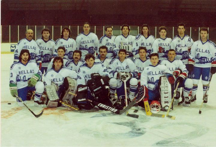
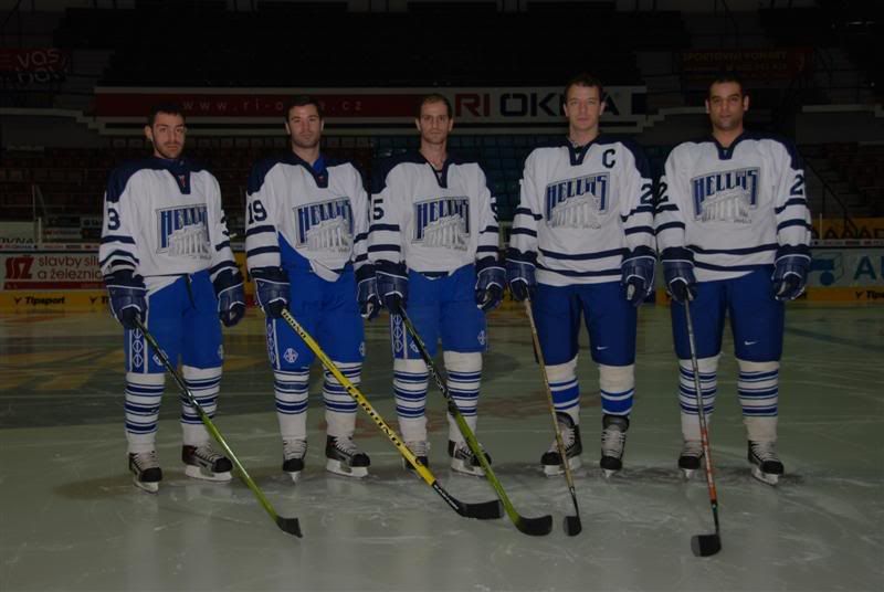
Greece's National Ice Hockey team recently qualified for the Division 3 IIHF World Championships. Did you know they had a team? Me neither. However, they do have some of the most attractive jerseys in the hockey world, in my opinion. Back in 1992, Greece wore these jerseys. They're kind of neat with the ruins, but very simplistic in their design. This past year, Greece skated in these jerseys. I find those jerseys beautiful. I love the image of the Parthenon on the jersey with "Hellas" rising behind it. The colours of Greece's flag make this jersey an excellent design. However, Greece has raised the bar on their jerseys again for 2008. This year, the Greek team will skate in a white version and a blue version of their new jerseys. Excellent design, great look, and one of the best international jerseys to date.
The AHL's Grand Rapids Griffins wore these promotional jerseys for one night before putting them up for auction. I actually like these better than their Detroit Red Wings-themed alternates.
The AHL's Hershey Bears went with Christmas jerseys this season. I'm not convinced these are good jerseys. While I like the Santa hat on the bear in their logo, do they really need to scream "Merry Christmas" on the lower third of the jersey?
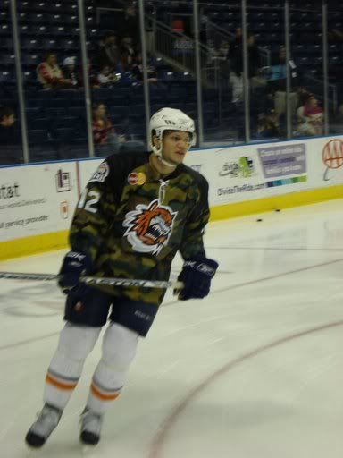
The NCAA's Hobart College Statesmen held a Military Tribute Night this season. Not bad, but they either needed a darker green for the camouflage or a different colour. The orange clashes with that shade of green in my view.
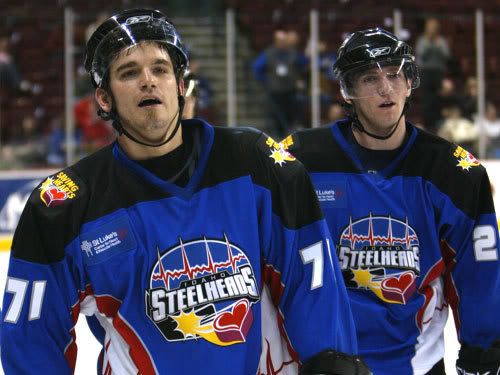
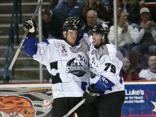
The ECHL's Idaho Steelheads went with a few charity-themed jerseys this season. They sported the American Heart Association jerseys. They also held an Athletes Aganist Autism night with their jerseys reflecting the Autism Speaks puzzle pieces. Two very good causes, and two very decent and respectful jerseys. The Steelheads also celebrated the achievement of the Boise State college football team by sporting jerseys that are similar to the college's football uniforms. These are ok, but enough with cross-sport promotions.
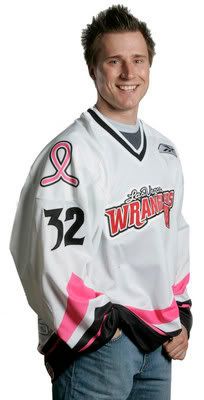
The ECHL's Johnstown Chiefs went pink with their jerseys to help with breast cancer research. I can't fault the Chiefs for helping out a good cause, so these jerseys get a thumbs-up.
The OHL's Kitchener Rangers wore some very impressive Remembrance Day jerseys. This is the first Remembrance Day jersey that I've seen that includes a poppy in a logo. Beautiful jersey, Kitchener. Well done!
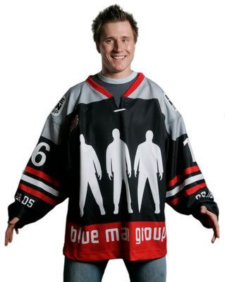
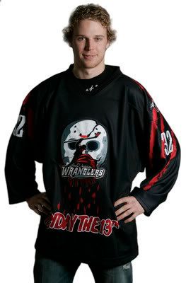
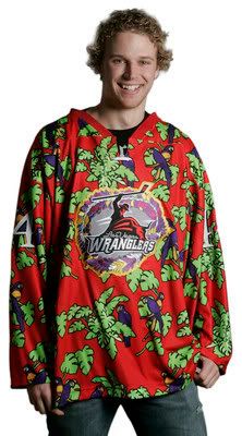
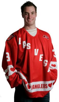
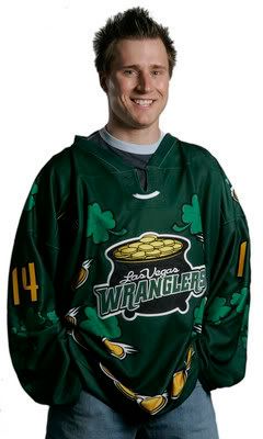
The ECHL's Las Vegas Wranglers appear to be making themselves a fixture on these lists. Let's start with the idiotic: Blue Man Group jersey. This is a complete mockery of a promotional jersey. Next, we have the dumb: Friday the 13th jersey. I suppose this could be worn as a Halloween jersey, but is anyone thinking "sellout"? From there, we have the inexplicable: Hawaiian jersey. Las Vegas wants to celebrate a tropical destination? Are they jealous of Hawaii's tropical climate due to living in desert? What does hockey have to do with Hawaii? On to the charitable: Cancer Research jersey and American Heart Association jersey. A couple of fairly plain jerseys, but both go to help very worthy causes. Finally, we have the good: St. Patrick's Day jersey. This jersey is the best of all the promotions, and might be the best St. Patrick's Day jersey I've seen on any team thus far.
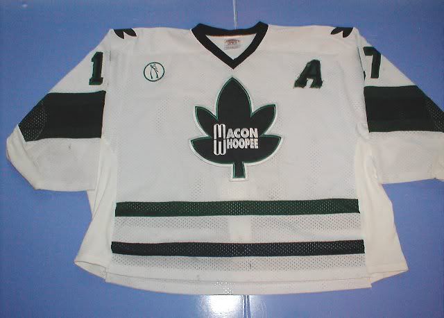
The Central Hockey League's Macon Whoopee have to be mentioned. Despite their logo looking possible like a reference to a drug, the team just had a great name. Macon Whoopee. I love it. They could have had better jerseys, but their name basically is the draw.
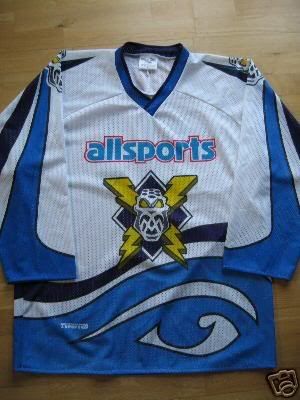
The English Ice Hockey League's Manchester Storm used to wear these jerseys before they folded in 2002. The lightning in the logo I understand, but the mask doesn't seem to fit. Also, what's with the big eye on the lower left of the jersey? Is that supposed to be the "eye of the storm"? Could they make they any less clear?
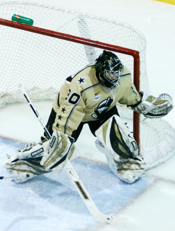
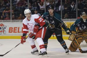
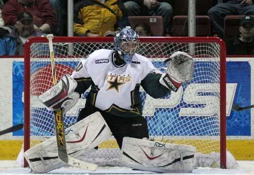
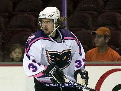
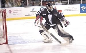
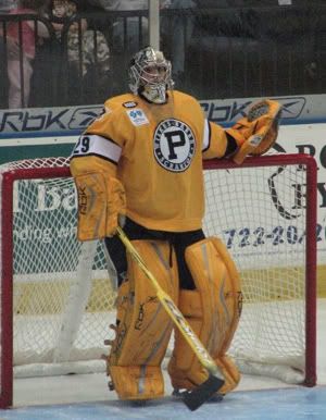
This is Matt Zaba. He has never played for the Dallas Stars. He has suited up for the ECHL's Idaho Steelheads, though. If you notice the small advertisements on his jerseys, you might be able to guess that the Steelheads held a night to honour the Dallas Stars by wearing their jerseys. I don't really find the purpose of this promotion, but at least it made the Double-A club look like their parent NHL affiliate. Thanks to Matt A. for the heads-up!
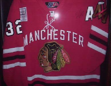
The AHL's Manchester Monarchs went back to the future by wearing the 1967 Manchester Hawks uniforms for a game this season. These are pretty decent uniforms. They make the grade.
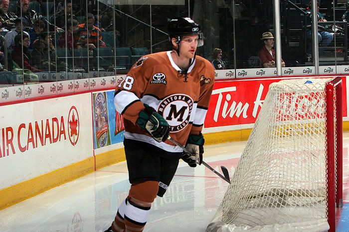
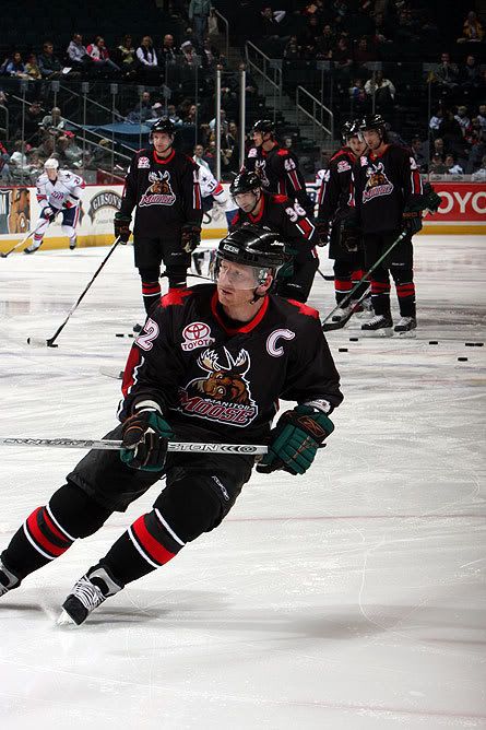
The AHL's Manitoba Moose went with throwback uniforms this season for one night as well. These are pretty decent. The Moose also honoured the gold-medal winning Team Canada World Junior Team by wearing Team Canada-themed jerseys. Like the first version, these jerseys are a great idea.
The Central Hockey League's New Mexico Scorpions held a Military Tribute night, and wore these American flag-inspired jerseys. There not much new to report here. Like a lot of the other flag-inspired tribute jerseys, it looks somewhat the same.
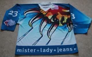
The DEL's Nürnberg Ice Tigers wore this interesting jersey in 2002-03. I chuckled at the "mister+lady+jeans" advertising at the bottom hem, but, being that the German Elite League relies on sponsorship, I suppose this should be expected. However, the giant claw is a different jersey and logo design.
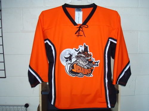
The CHL's Odessa Jackalopes have worn a few promotional jerseys as well. Their Halloween jerseys may make them look like pylons, but full marks for the changing their logo to match the promotion. Their Thanksgiving-themed jerseys were better, and the logo is certainly appropriate.
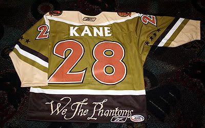
The AHL's Philadelphia Phantoms have made the list again, and they have a pile of promotions they have done. In 2002, the Phantoms wore Christmas-themed jerseys. Kind of boring, but a nice touch with the Santa hat. In 2003, the Phantoms wore the jerseys of the Philadelphia Firebirds. The Firebirds were a member club of the minor-league North American Hockey League, and featured long-time NHL goalie Rejean Lemelin in net before he jumped to the NHL. The Phantoms celebrated St. Patrick's Day in 2005 and 2006. The 2006 jersey is infinitely better than the extremely boring 2005 version. In 2005, the Phantoms wore the jerseys of the Philadelphia Blazers. The Blazers played one season in the WHA in Philadelphia before moving to Vancouver. However, they did sign such stars as goaltender Bernie Parent and forward Derek Sanderson. The Phantoms also contributed to a charitable cause by wearing jerseys for breast cancer research that were later auctioned off. And the Phantoms added to their promotional legacy by wearing hideous President's Day jerseys this season. Simply hideous.
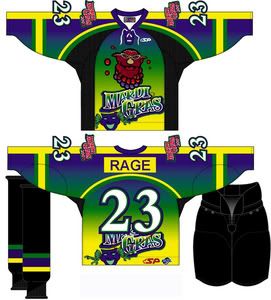
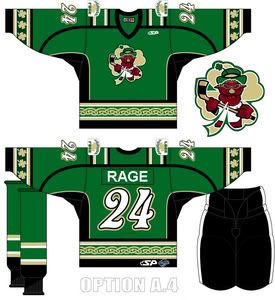
The CHL's Rocky Mountain Rage continued their promotional jersey ocular assault. The Rage celebrated Mardi Gras last season with a jersey. And they wore a decent St. Patrick's Day jersey as well. Mardi Gras in the Rockies... are you kidding me?
With word of NHL alternate jerseys returning next season, and having up to 18 teams interested in having one, let's hope we never see this baby puke jersey from Nashville again. The one thing that did catch my eye is the "Nashville" under the neckline. Did anyone notice that before?
The CHL's Corpus Christi Rayz make an appearance on this list for four jerseys. First, they had a New Year's Eve and a New Year's Day jersey in 2007. I think it would be pretty cool if a team actually used them for home and away games. The third promotion that the Rayz were involved in was a Harley-Davidson Night. Having seen these before, they aren't that special. However, the fourth jersey was worn for Military Tribute Night. The Rayz donned jerseys for the United Service Organizations in honour of the troops. The United Service Organizations Inc. (USO) is a private, nonprofit organization that provides morale and recreational services to members of the U.S. military worldwide. A great jersey for a great cause.
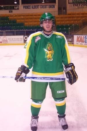
The WHL's Prince Albert Raiders went with throwback jerseys on September 13, 2005. These seem quite pastel, and pastels don't work well in a violent sport. While the idea is ok, the jerseys aren't all that great.
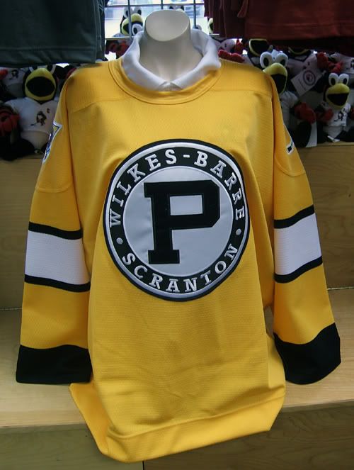
The Wilkes-Barre/Scranton Penguins introduced a bold alternate jersey this season. While the Moose throwback jersey resembles it, I like this jersey. And with it being as yellow as it is, it made the Penguins' Marc-Andre Fleury look like a beacon on the ice during his reconditioning stint following his injury.
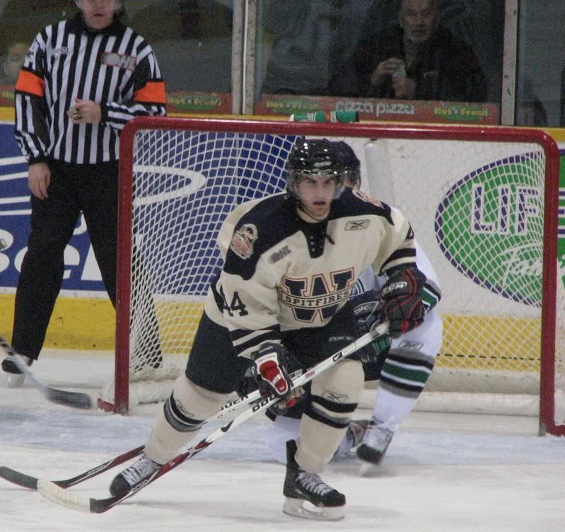
The OHL's Windsor Spitfires went back to the future as well as they broke out their 1950 edition of their jersey. These are fabulous jerseys in terms of their look. Classic, simple, and elegant. Thumbs-up on these jerseys. However, the Rbk logo on the socks needs to go. Like now. That's bordering on Euro-hockey advertising.
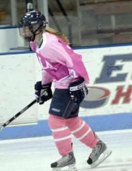
And finally, we come to the NCAA's Yale Bulldogs whose women's team went completely pink in their support for breast cancer research. Great jerseys for a great cause. My only complain is that they didn't match the socks' pink colour to the jersey. However, I commend all the teams of the ECAC Women's Hockey Division as every team participated in the pink jersey promotion. Well done, ladies!
Ok, so hopefully you haven't expelled a meal with some of these jerseys. Honestly, there are some good ones on there, and a lot of charity ones. As long as teams keep making them, I'll keep featuring them on articles like this.
Until next time, keep your sticks on the ice!


7 comments:
Bakerfield is so far from Hollywood (distance- but mainly culture-wise) that there's really no reason why they had Hollywood jerseys. I can understand the country music because usually in bumble-f*ck California cities country music is popular.
You may not realize, but the Milwaukee Admirals have so many tie-ins with the Brewers because included in their ownership group is Brewers owner Mark Attanasio and Ben Sheets. That explains the everpresent Brewers logo on the shoulder and these god-awful baseball sweaters.
Bakersfield, of course, was home of the Bakersfield Sound movement within country music. "Artists" such as Merle Haggard came from that area.
Those Black Knight jerseys are nice, but I realized after looking at them that they're a re-tooling of the Blue Jackets' 3rd jersey from the last few seasons. Of course, the colors, logos, and fonts are different, but the jersey sleeve and hem stripes as well as the 3 stars on the lower sleeves are straight from the Jackets.
KMS basically said what I was gonna say about the Bake town (or Bake-O). In central and northern cali, country music is pretty popular.
The NCAA's Hobart College Statesmens' jerseys...can we say hideous??
So...can you tell me who's modeling the ECHL's Las Vegas Wranglers' jerseys?
I think your issue with the PA Raiders throwback colours might be the quality of the picture contrast. I remember these jerseys from when they used to play the Wheaties and the colour scheme was very similar to the North Stars green/yellow combo.
Those Las Vegas ones are godawful, but I really liked that USO tribute jersey - may be a function of the USO logo being a nice clean, classic font.
I believe the Matt Zaba jersey you have listed as Iowa Stars, is actually from the game he played for Idaho Steelheads against the Alaska Aces (ECHL). They had an NHL Affiliation Night - Alaska wore Blues jerseys and Idaho wore Stars jerseys.
You are correct, Matt. I'll make the change now.
Thanks for the heads-up!
Post a Comment